With the internet increasingly being accessed via mobile devices, having a static website design that solely looks excellent on a computer screen is no longer sufficient.
Not to mention that when creating a design, you must consider tablets, 2-in-1 computers, and various smartphone models with varying screen sizes. So simply dumping your material into a single column and calling it a day won’t cut it.
With a responsive web design, you can ensure that your website appears great on mobile devices, tablets, laptops, and desktop computers. Increased conversions and business growth result from the improved user experience.
This book will teach you all you need to know about responsive website design, including terminology, a step-by-step overview, and examples.
What Is Responsive Web Design?
Responsive design is a web design method that adapts your site content to multiple screens and window sizes on several devices. For Instance, at desktop screens your information may be divided into different columns because they are wide enough to accommodate such a design.
It can be tough for users to read and interact with your information if you divide it into many columns on a mobile device. Responsive design allows you to send numerous, distinct layouts of your information and design to different devices depending on their size.
Why Is Responsive Design Important?
The solution is straightforward. It is no longer sufficient to design for a single device. Mobile web traffic has surpassed desktop traffic and now accounts for more than 51% of all website traffic.
When more than half of your potential visitors are using a mobile device to explore the internet, you can’t simply serve them a desktop-designed page. It would be difficult to understand and use, resulting in a poor user experience.
But it isn’t all. Mobile device users also account for the vast bulk of search engine visits.
Finally, in recent years, mobile has emerged as one of the most essential advertising mediums. Even in the aftermath of a pandemic, mobile ad expenditure is up 4.8% to $91.52 billion.
Whether you want to advertise on social media or use an organic strategy like YouTube SEO, mobile users will account for the great majority of your traffic.
You won’t be able to maximise the ROI of your marketing efforts if your landing pages aren’t mobile-friendly and simple to use. Poor conversion rates result in fewer leads and wasted ad expenditure.
Adaptive Web Design vs. Responsive Web Design

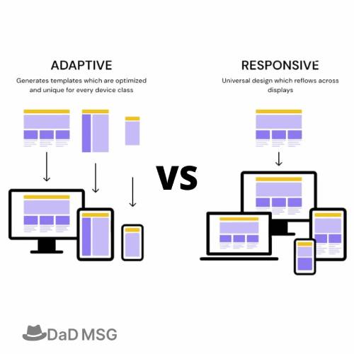
The primary distinction between responsive and adaptable design is that responsive design modifies the rendering of a single page version. Adaptive design, on the other hand, provides numerous completely different versions of the same page.
They are both important web design trends that let webmasters customise how their site looks on different screens, but they take distinct approaches.
Users will access the same basic file through their browser regardless of device, but CSS code will govern the layout and present it differently depending on screen size. There is a script in adaptive design that examines the screen size and then accesses the template.
Techniques for responsive web design
Let’s look at five responsive design techniques you may use right now:
- Vector Scalable Images
Scalable vector pictures enable images to be resized without losing quality. As you can expect, there is a lot of zooming on mobile devices, thus keeping quality regardless of size is critical. While the SVG specification is far from young, it still has contemporary tools and browser support that keep it relevant, and this old dog has plenty of new tricks up its sleeve.
Remove the height and width attributes that are automatically added to photos for scalability. However, if you want your modest logos and icons to be gradually enhanced, we recommend leaving the height and width at their default values. - CSS Sprites
Reduced requests are one of the most effective ways to minimise a page’s loading speed, and CSS sprites can help with that. Combine all of your small and common images into a single file, which you can subsequently utilise for CSS sprites, allowing you to serve a single site across many devices.
Keep in mind that CSS sprites do not scale without some outside help, therefore for compatible browsers that support CSS 3, you may wish to use the new CSS 3 background-size property. - Considering “Mobile First”
This “technique” is more of a concept and approach than a precise procedure.
Mobile-first techniques, as opposed to scaling from the desktop to the mobile device, scale from the mobile device to the desktop. While these procedures aren’t always quick or simple, the outcomes are usually well worth the effort.
Designing your website expressly for the mobile experience can be a huge benefit, especially if you can create a site that is responsive on desktop and laptop devices.
While mobile-first web design is still gaining traction, now is the time to begin implementing the most cutting-edge design approaches. - Gridding
Using a grid system helps to keep your work organised and consistent. It promotes a smooth workflow by allowing you to proportionally balance the parts of your design and work. It also provides your website with a consistent structure from one page to the next. However, you should maintain your grid system adaptable so that you can modify it to your immediate needs when creating a page with a different layout.
Experiment with working with limitations and constraints. Consider designing using 6 text columns instead of 16 to improve readability. Working inside clearly defined boundaries can assist you in narrowing your concentration and reducing distractions, allowing you to accentuate your topic. - Degradation with Grace
Because not everyone will be using the most recent browsers, you must take steps to ensure that as many users as possible have a good (or at least usable) surfing experience.
Designing your website with graceful degradation/progressive enhancement means that mobile users do not need to upgrade to the most recent browser update to visit your website. After all, many website visitors would rather quit than upgrade. Finally, smooth degradation enables you to throw a wide net while keeping everyone pleased.
Conclusion
Responsive web design incorporates many distinct features. It is easy to make mistakes if you do not have a fundamental understanding of HTML and CSS.
However, by becoming acquainted with the various building components, evaluating the examples with web development tools, and testing as you go with the sample code, you should be able to make your website responsive without serious issues.


